Mr. Rostan at the Movies: The Still and Moving Pictures of Criterion
Andrew Rostan was a film student before he realized that making comics was his horrible destiny, but he’s never shaken his love of cinema. Every two weeks, he’ll opine on either current pictures or important movies from the past.
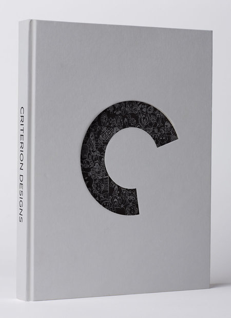
Thirty days before Christmas, one of this year’s best gifts for the film fan will be released. Criterion Designs is a 300-page coffee table book documenting the art of the Criterion Collection. Since 1984, first on laserdisc and now on DVD and Blu-Ray, Criterion has been responsible for reissuing the greatest films ever made in the best possible formats—they popularized letterboxing, restoration, and commentary tracks.
With all this, any fan will tell you that the hallmark of the collection is its design. World-class illustrators and designers work on each new release to create iconic imagery that, minimalist or elaborate, can tell an entire story in a single frame. (Indeed, Criterion art is now so distinctive that many outstanding parody sites have sprung up that give the label’s treatment to much less-deserving films.) The treat of Criterion Designs is in its presentation of sketches and first drafts, culminating in a gallery of every single cover. It’s an art lover’s dream…
That should also serve to make one go out and watch some of the movies. The Criterion Collection’s presentation, for all its aesthetics, is ultimately packaging—but packaging in the best “form serving content” sense. Last week, I wrote about Karina Longworth’s podcast You Must Remember This, and in one episode Longworth discussed how we have so few of the earliest films ever made because producers would simply throw film stock away. The Criterion Collection, in the care it lavishes, is an affirmation that film is not disposable but one of our highest art forms, a dramatic and visual experience like no other that is worth preserving and elevating.



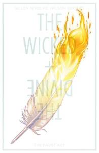 This time around, J. & Steph discuss the newest addition to the “young adult meets the supernatural” genre. Is that a genre yet? If not, it probably should be at this point. The Wicked & The Divine is an amorous take on the concept, a story of mysteries piled upon